The look and feel of your website matters. It can either attract new customers or repel them in the opposite direction.
Website builders make it easier to design with drag-and-drop templates. But all templates aren’t created equal. You need a specific design that fits your brand personality, welcomes visitors, and offers good functionality.
5 Key Factors to Consider When Choosing a Web Design Template
It’s your turn to create a jaw-dropping website. Below are 5 factors to consider when choosing a web design template that follows design best practices.
1. Header Design
The header is the first part of the website your visitors see. Your primary goal is to welcome your audience with open arms and spark their curiosity to browse around.
Most header designs include the brand’s logo coupled with an engaging image. The text usually offers context and adds a simple call to action.
Your site’s header will rely on how complex or easy it is to explain your brand. Brenda Barron, an instructor for Tuts+, offers more insight:
'Using a captivating image to create an amazing visual experience works well for businesses such as hotels, restaurants, or spas. If on the other hand, your type of business might be hard to explain with image only, you should choose a header design that incorporates an image with a text overlay.'
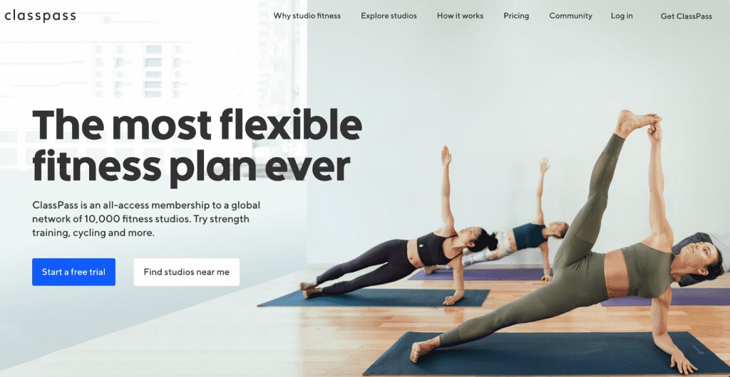
ClassPass, a health club aggregator, uses a header image to display its business model. The straightforward copy gives the company’s description with two call-to-action buttons.

First impressions hold significance online. Choose a web design template that showcases your brand in a positive light.
2. Navigation Design
When you enter a brick-and-mortar store, it’s fairly easy to locate items. They have signs labeling specific aisles, a designated area for customer service, and even a floating store clerk to assist you. Similarly, it’s important to recreate that shopping experience online.
The menu bar acts as a roadmap, guiding your visitors to certain pages on your site. It should be readable with a plain background color and simple fonts.
The key is not to overwhelm your consumers. An overcrowded menu isn’t visually pleasing, and it can complicate the visitor’s experience.
You’ll also want to create a hierarchy, or architecture, for your pages. For the layout, place the most important pages on the left. You can use a different color or add a familiar symbol to underline critical details.
In the example below, Havertys provides an easy-to-access menu for customers to learn about its products. The brand also gives visitors options to receive free design help.

Navigation design gives your visitors a clear direction on what to do next. Be their personal guide through the online experience.
3. Functionality
It’s not enough to have cool pictures and funky colors on your site. You need to give your site purpose by adding functionality.
Start by deciding what you want visitors to achieve with your site. Do you want customers to purchase products? Do you want them to contact you at specific times?
Your website’s goal will help you select the right template. If you want visitors to connect with you directly, you may need a live chat feature. If you want customers to shop, you will need an eCommerce store. Perry Lara, creative director at Viral Element, says:
'Given that your website is your best salesperson, you should take the necessary steps to ensure your website functions properly before and after it’s launched. A poor functioning website can mean the difference between generating new leads and completely missing out on lead-generating opportunities.'
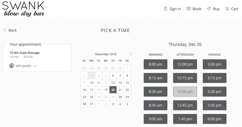
SWANK blow dry bar offers its visitors the choice to book an appointment on its website. With this functionality, the brand streamlines the process of gaining a new customer.

Functionality makes your website more than a pretty online space. A successful eCommerce web design template can transform a hesitant visitor into a loyal shopper.
4. Content Area
Content plays an essential role in your website. The text and images fill out your design and inform your visitors about your products and services.
Depending on your brand, your content area may include a blog, photo gallery, or a slideshow. Choose a content section that helps your visitors learn more about your value.
However, don’t complicate your design with too many content areas. The clutter will confuse (or maybe annoy) visitors on where they should focus their attention. If they can’t decide what to do next, it’s likely they will just leave your site.
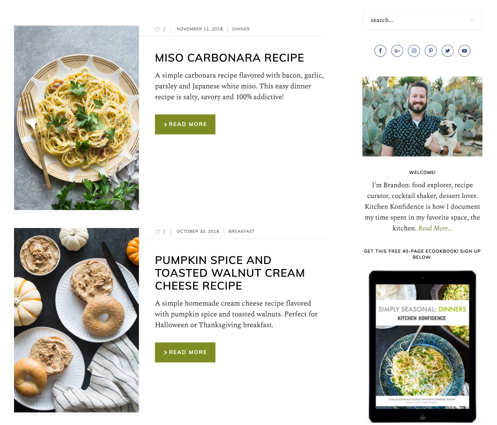
Kitchen Konfidence exhibits a vivid content area with beautiful photos, concise descriptions, and direct call-to-action buttons. Also, there’s enough white space to not overwhelm visitors with loads of content.

Your content area is a good place to experiment with how your brand presents information. For instance, you may use a fixed sidebar with your navigation menu, social media links, and contact details.
Your web design template should tell a story. Be selective on what content areas you use.
5. Mobile Version
According to Statista, 'the number of mobile phone users is forecast to reach 4.68 billion in 2019.' This research means a potential increase in website engagement from consumers.
Mobile users expect to get what they need quickly without any hassle. Jenny Gove, a UX Research Lead at Google, states:
'Make it easy to get back to the home page. Users expect to go back to the homepage when they tap the logo in the top-left of a mobile page, and they become frustrated when it isn’t available or doesn’t work.'
Plan for fewer words on your mobile site. The headlines should be short to fit the mobile screen. Also the content should be easy to skim.
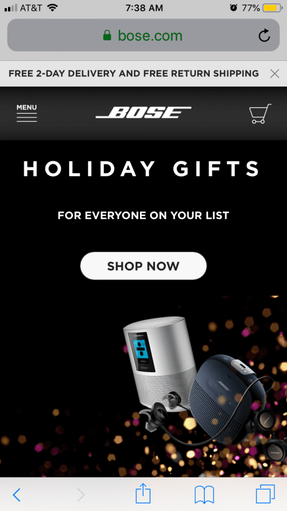
Bose’s mobile site highlights the essential details. On first glance, a visitor sees the brand’s logo, menu, primary call-to-action, and an image of the product. The copy is short and sweet, too.

Your mobile website should follow the same brand style and color palate of your desktop version. Using a different variation will only distract visitors from your brand’s value.
Choose Your Web Design Template Wisely
Your web design template is the foundation for your site. Your goal is to create a useful and attractive website.
There’s a lot that goes into finding the best web design template that meets that goals. Fortunately, website builders like our Gator Website Builder make it easy. We have hundreds of mobile-friendly templates for you to choose from, and they all follow the latest trends in modern web design. Take a look today to find the best one for your business.
Shayla Price creates and promotes content. She lives at the intersection of digital marketing, technology, and social responsibility. Originally from Louisiana, Shayla champions access to remote work opportunities. Connect with her on Twitter at @shaylaprice.

